HomePage
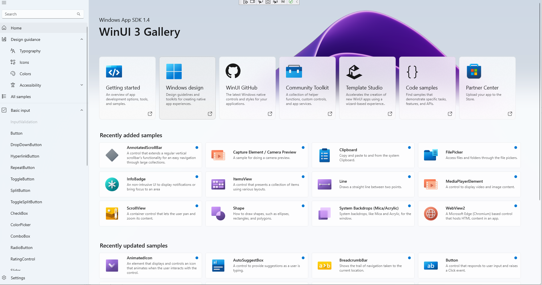
主页长这个样子:
首先看xaml代码(HomePage.xaml):
<local:ItemsPageBase
    x:Class="AppUIBasics.HomePage"
    xmlns="http://schemas.microsoft.com/winfx/2006/xaml/presentation"
    xmlns:x="http://schemas.microsoft.com/winfx/2006/xaml"
    xmlns:controls="using:AppUIBasics.Controls"
    xmlns:controls1="using:WinUIGallery.DesktopWap.Controls"
    xmlns:local="using:AppUIBasics"
    HighContrastAdjustment="None"
    NavigationCacheMode="Enabled">
...
</local:ItemsPageBase>
ItemsPageBase是一个继承自Page和INotifyPropertyChanged的抽象类:
 public abstract class ItemsPageBase : Page, INotifyPropertyChanged {
    public event PropertyChangedEventHandler PropertyChanged;
        private string _itemId;
        private IEnumerable<ControlInfoDataItem> _items;

        public IEnumerable<ControlInfoDataItem> Items {
            get { return _items; }
            set { SetProperty(ref _items, value); }
        }
 }
PropertyChangedEventHandler
继承了这个玩意儿之后这个Page相当于就可以作为一个Binding Source了,可以参考《深入浅出WPf》Page 84。
这里面需要通知给外面的是 Items(它的set函数中有Notify)。
protected bool SetProperty<T>(ref T storage, T value, [CallerMemberName] string propertyName = null) {
    if (Equals(storage, value)) {
        return false;
    }
    storage = value;
    NotifyPropertyChanged(propertyName);
    return true;
}
protected void NotifyPropertyChanged([CallerMemberName] string propertyName = null) {
    PropertyChanged?.Invoke(this, new PropertyChangedEventArgs(propertyName));
}
这里的[CallerMemberName]是个注解, 编译器会自动填上”Items”。
继续往下看(HomePage.xaml)
    <Page.Resources>
        <CollectionViewSource x:Name="itemsCVS" IsSourceGrouped="true" />
    </Page.Resources>
这里定义了一个资源, 名字叫做”itemCVS”, 暂时不管。
<Grid>
    <VisualStateManager.VisualStateGroups>
        <VisualStateGroup x:Name="LayoutVisualStates">
            <VisualState x:Name="WideLayout">
                <VisualState.StateTriggers>
                    <AdaptiveTrigger MinWindowWidth="{StaticResource Breakpoint640Plus}" />
                </VisualState.StateTriggers>
            </VisualState>
            <VisualState x:Name="NarrowLayout">
                <VisualState.StateTriggers>
                    <AdaptiveTrigger MinWindowWidth="0" />
                </VisualState.StateTriggers>
                <VisualState.Setters>
                    <Setter Target="learnMoreGrid.Margin" Value="16,36,0,36" />
                    <Setter Target="itemGridView.Padding" Value="4,0,4,36" />
                    <Setter Target="itemGridView.ItemContainerStyle" Value="{StaticResource IndentedGridViewItemStyleSmall}" />
                </VisualState.Setters>
            </VisualState>
        </VisualStateGroup>
    </VisualStateManager.VisualStateGroups>
</Grid>
出现新东西了,VisualStateGroup是啥?
VisualStateManager.VisualStateGroups
好像只是一个状态记录?
setter 是啥
setter通常和style一起用, 一般是”属性名=属性值”的形式,就是一个”设置器”:
<Setter Property="FontSize" Value="24"/>
举个例子:
<Style TargetType="TextBlock" x:Key="style1">
    <Style.Setters>
        <Setter Property="FontSize" Value="24"/>
    </Style.Setters>
</Style>
<TextBlock Text="hello, style" Style="{StaticResource style1}">
接着往下看,
<GridView>
<GridView.Header>
        <Grid x:Name="HeaderGrid" Margin="-24,0,-24,0">
            <Grid.RowDefinitions>
                <RowDefinition Height="204" />
                <RowDefinition Height="*" />
            </Grid.RowDefinitions>
            <controls:HomePageHeaderImage
                Grid.RowSpan="2"
                Height="396"
                VerticalAlignment="Top" />

            <TextBlock AutomationProperties.AutomationId="__ClickableAreaTextBlock" />
            <StackPanel
                Margin="36,0,0,0"
                VerticalAlignment="Center"
                Orientation="Vertical">
                <TextBlock
                    x:Name="smallHeaderSubtitleText"
                    FontSize="18"
                    Text="{x:Bind WinAppSdkDetails}" />
                <TextBlock
                    x:Name="smallHeaderText"
                    Style="{StaticResource TitleLargeTextBlockStyle}"
                    Text="{StaticResource AppTitleName}" />
            </StackPanel>

            <controls:TileGallery
                x:Name="headerTileGallery"
                Grid.Row="1"
                Margin="0,0,0,0" />
        </Grid>
    <GridView.Header>
</GridView>
在Header里面定一个了一个Grid,就是这块区域:

<Grid x:Name="HeaderGrid" Margin="-24,0,-24,0">
                    <Grid.RowDefinitions>
                        <RowDefinition Height="204" />
                        <RowDefinition Height="*" />
                    </Grid.RowDefinitions>
                    <controls:HomePageHeaderImage
                        Grid.RowSpan="2"
                        Height="396"
                        VerticalAlignment="Top" />

                    <TextBlock AutomationProperties.AutomationId="__ClickableAreaTextBlock" />
                    <StackPanel
                        Margin="36,0,0,0"
                        VerticalAlignment="Center"
                        Orientation="Vertical">
                        <TextBlock
                            x:Name="smallHeaderSubtitleText"
                            FontSize="18"
                            Text="{x:Bind WinAppSdkDetails}" />
                        <TextBlock
                            x:Name="smallHeaderText"
                            Style="{StaticResource TitleLargeTextBlockStyle}"
                            Text="{StaticResource AppTitleName}" />
                    </StackPanel>

                    <controls:TileGallery
                        x:Name="headerTileGallery"
                        Grid.Row="1"
                        Margin="0,0,0,0" />
                </Grid>
定义了两行,HomePageHeaderImage横跨两行(Grid.RowSpan=”2”), StackPanel在第一行(默认?)并且包含2个字块。
第二行就是自定义个的一个TileGallery,看上去有点复杂。
先看这个背景图片的实现:
<controls:HomePageHeaderImage
                        Grid.RowSpan="2"
                        Height="396"
                        VerticalAlignment="Top" />
它在control目录下:
<UserControl
    x:Class="AppUIBasics.Controls.HomePageHeaderImage"
    xmlns="http://schemas.microsoft.com/winfx/2006/xaml/presentation"
    xmlns:x="http://schemas.microsoft.com/winfx/2006/xaml"
    xmlns:d="http://schemas.microsoft.com/expression/blend/2008"
    xmlns:mc="http://schemas.openxmlformats.org/markup-compatibility/2006"
    xmlns:toolkit="using:CommunityToolkit.WinUI"
    Loaded="OnLoaded"
    Loading="OnLoading"
    Unloaded="OnUnloaded"
    mc:Ignorable="d">
    <UserControl.Resources>
        <ResourceDictionary>
            <ResourceDictionary.ThemeDictionaries>
                <ResourceDictionary x:Key="Light">
                    <LinearGradientBrush x:Name="BackgroundGradient" StartPoint="0.5,0" EndPoint="0.5,1">
                        <GradientStop Offset="0.0" Color="#CED8E4" />
                        <GradientStop Offset="1.0" Color="#D5DBE3" />
                    </LinearGradientBrush>
                </ResourceDictionary>
                <ResourceDictionary x:Key="Dark">
                    <SolidColorBrush x:Key="BackgroundGradient" Color="Black" />
                </ResourceDictionary>
                <ResourceDictionary x:Key="HighContrast">
                    <SolidColorBrush x:Key="BackgroundGradient" Color="Black" />
                </ResourceDictionary>
            </ResourceDictionary.ThemeDictionaries>
        </ResourceDictionary>
    </UserControl.Resources>
    <Grid>
        <Grid
            x:Name="ImageGrid"
            Background="{ThemeResource BackgroundGradient}"
            Opacity="0">
            <Image
                x:Name="HeroImage"
                toolkit:VisualExtensions.NormalizedCenterPoint="0.5"
                ImageOpened="OnImageOpened"
                Source="/Assets/GalleryHeaderImage.png"
                Stretch="UniformToFill" />

            <Image
                x:Name="HeroOverlayImage"
                toolkit:VisualExtensions.NormalizedCenterPoint="0.5"
                Opacity="0.5"
                Source="/Assets/GalleryHeaderImage.png"
                Stretch="UniformToFill" />

        </Grid>
        <Rectangle x:Name="ImageGridSurfaceRec" Fill="Transparent" />
    </Grid>
</UserControl>
还没搞懂,暂时先略过。
接着看TileGallery,也在controls目录下,代码更加复杂了,一点点分析吧。
TitleGallery里面包了一个ScrollViewer, item是HeaderTile。主要学习一下这个绑定外部资源的方式:
 <local:HeaderTile
    Title="Getting started"
    Description="An overview of app development options, tools, and samples."
    Link="https://learn.microsoft.com/windows/apps/get-started/">
    <local:HeaderTile.Source>
        <Image Source="/Assets/HomeHeaderTiles/Header-WinUIGallery.png" />
    </local:HeaderTile.Source>
</local:HeaderTile>
这里我们看到 HeaderTile赋值了 Title、Description、Link等属性,那么它们是如何绑定到HeaderTile内部的。
HeaderTitle内部的一个StackPanel如下:
<StackPanel
    Grid.Row="1"
    Orientation="Vertical"
    Spacing="4">
    <TextBlock
        x:Name="TitleText"
        FontSize="18"
        Foreground="{ThemeResource TextFillColorPrimaryBrush}"
        Style="{StaticResource BodyTextBlockStyle}"
        Text="{x:Bind Title, Mode=OneWay}" />
    <TextBlock
        Foreground="{ThemeResource TextFillColorSecondaryBrush}"
        Style="{StaticResource CaptionTextBlockStyle}"
        Text="{x:Bind Description, Mode=OneWay}" />
</StackPanel>
原来,Bind还可以这么用。
HeaderTitle是一个包在Grid中的Button:
 <Grid>
    <HyperlinkButton>
    ...
    </HyperlinkButton>
 </Grid>
这个Button内部又包含一个Grid, Grid中有FontIcon、ContentPresenter以及一个有2行TextBlock的StackPanel。
这里ContentPresenter值得学习:
<ContentPresenter
    HorizontalAlignment="Left"
    VerticalAlignment="Top"
    Content="{x:Bind Source, Mode=OneWay}" />
在外面是如何为这个 Source赋值的呢?
// 一个简单的
<local:HeaderTile.Source>
    <Image Source="/Assets/HomeHeaderTiles/Header-WindowsDesign.png" />
</local:HeaderTile.Source>

// 一个复杂的
<local:HeaderTile.Source>
    <PathIcon Data="{StaticResource GitHubIconPath}" Foreground="{ThemeResource TextFillColorPrimaryBrush}">
        <PathIcon.RenderTransform>
            <CompositeTransform
                ScaleX="2.05"
                ScaleY="2.05"
                TranslateX="-20" />
        </PathIcon.RenderTransform>
    </PathIcon>
</local:HeaderTile.Source>
到这里,HomePage中的Grid.Header的布局就大概清楚了。